How Design Systems Are Created?
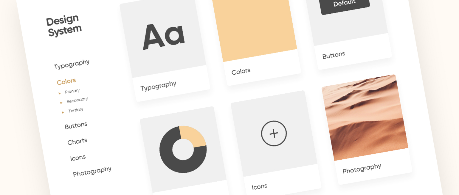
Most designers create their work in Figma, Sketch, or Adobe XD when creating design systems. First, several pages of the site are collected, where there is no detailed study of the system yet. Then the experience of these pages is systematized: fonts, sizes, margins, etc. And finally, the design system and all other pages are developed according to the principle of atomic design.
Note that designs can be changed throughout the development. However, the rules will stay, but the image may change. Everything is flexible and adjustable.
Each team sets personal tools for implementing the design – design system components. The system with the code is written separately. Some companies even publish the code in the public domain.
No specific software is needed to create UI design systems, but updates and plugins for the most visible tools will help speed up and simplify many processes.
After the release of the website, a team of designers and developers is needed. The team will solve any issues that may occur during the exploitation. If the existing set of rules is not suitable for the task, it needs to be rethought, rebuilt, and re-implemented. The team will also help with that.
What Does the Design System Include?
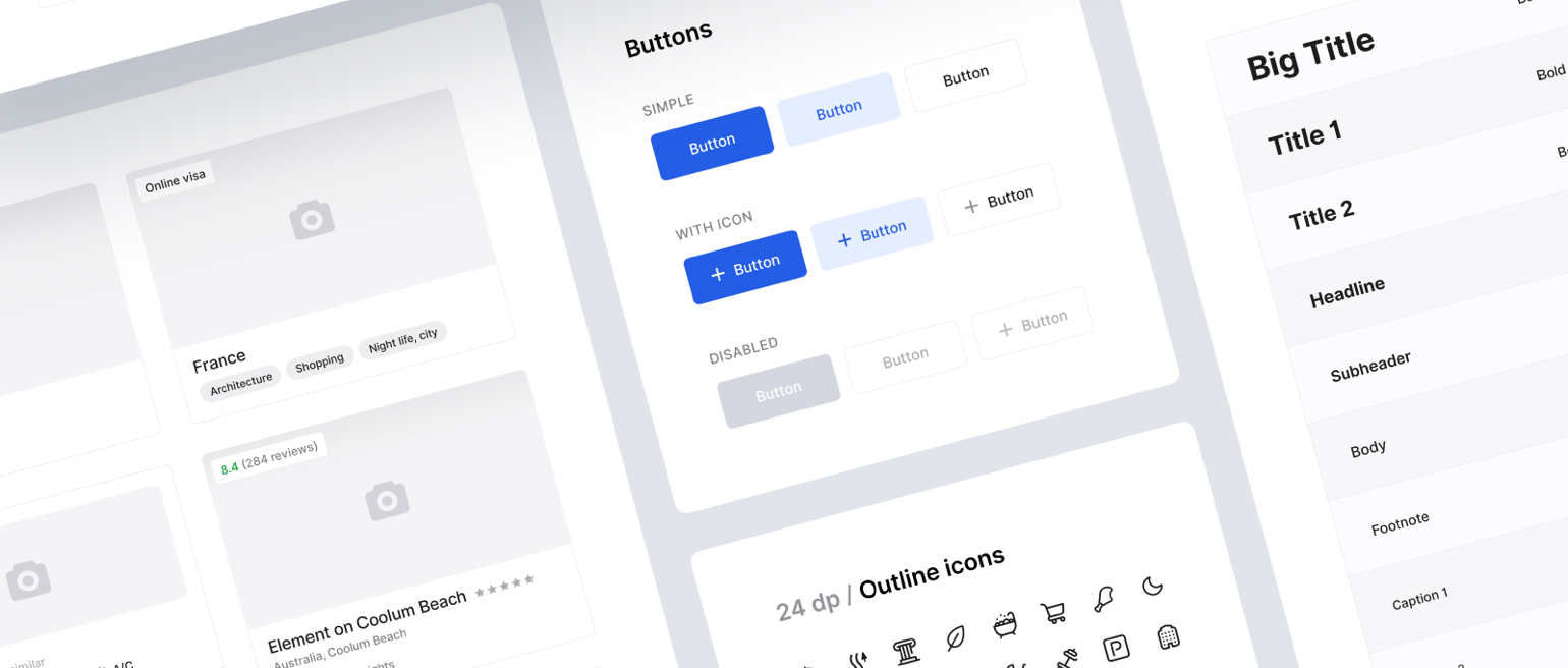
At first, the user experiences everything with the eyes. So it will be helpful to provide everything necessary to achieve the best results and create the perfect impression. This is where the visual language helps. It includes everything that is visual or helps to disclose the visual part of the website (colors, fonts, icons, shapes, objects, animations, etc.). This helps to create a small universe and a feeling about your product. Most of the time, the main colors are the same as the main colors of the brand. For example, when creating a Coca-Cola website, designers should use red, white, and black colors to create a sense of connection with the product design systems. Visual language code is a framework. It helps out when you need to create similar elements for different pages of a project or application. For example, there is a Pay button on the site. You will need the same button in the application but with another text. If there is no visual code library, then the button will have to be recreated. What if the application needs to change the color of such buttons and there are dozens of them? Should you change the colors over again? The framework will get rid of this problem. It will allow you to reuse, change something, in every detail of the product. And if suddenly the chief designer or developer leaves, the visual code will stay and you’ll be able to continue the work. A guide or set of rules for how things should look, what, and where objects and colors can be used. The guide just has to be as detailed as possible to make sure everything is right. If you feel like there’s enough information and some things can be omitted – you are wrong. Make sure you have all the tiniest things described.
Design System Pros
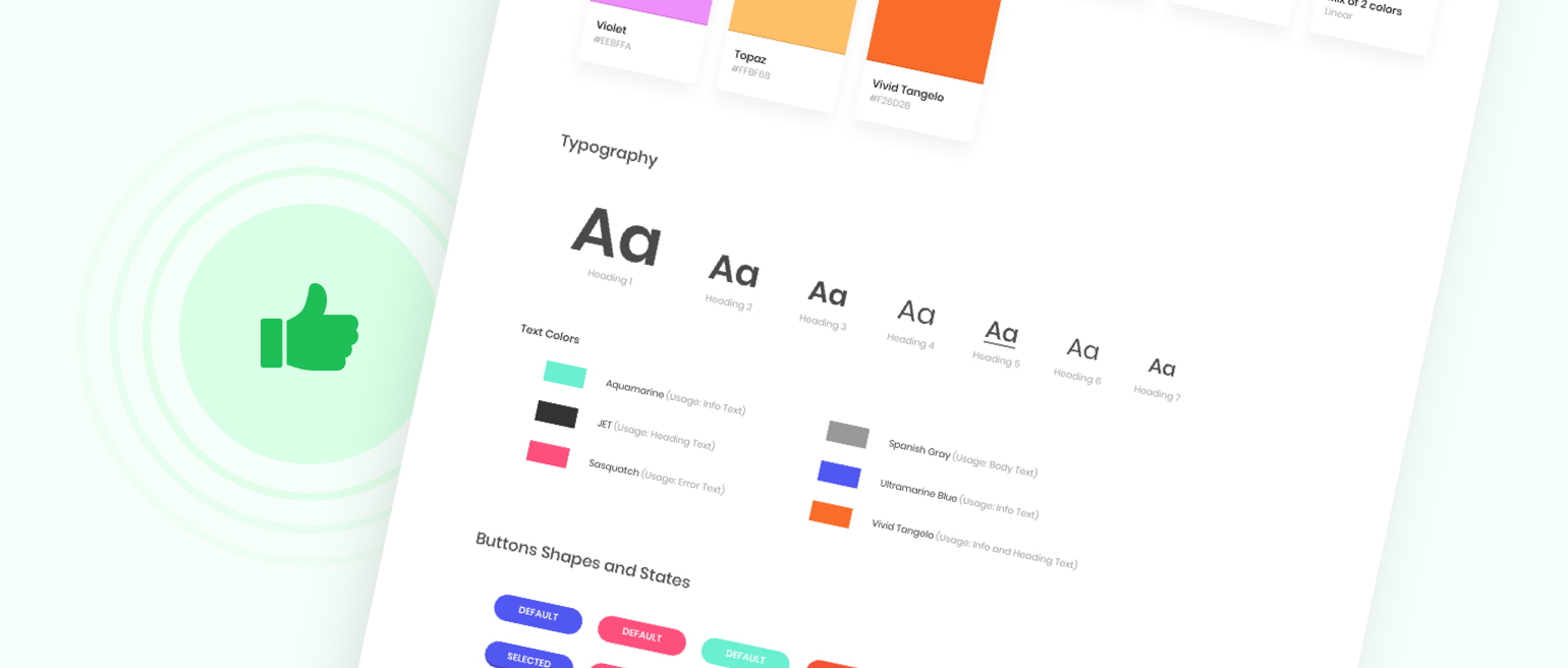
Of course, any solution has its pros and cons. Let’s check them.
-
Design solutions standardization. Everything is described clearly which allows making consistent designs and solutions: the same UX across all platforms. Due to the fixation of the best patterns, the standardization of the UI is also taking place: the website is easier to use.
-
Fast specialist immersion. Let's say there is one large project with a UI kit and another with a design system. In the first case, the designer is shown separate buttons. His or her job is to figure out how to combine them with the rest of the design. Whereas in the second case, he or she gets a ready-made set of elements. All that remains is to put together the finished page, which is, of course, is easier.
-
Design equals layout. Every time designers submit the work for layout, they must describe the principles by which everything is assembled: margins, colors, and so on. Without a clear system, something is either lost, or the developers misinterpret the task. One of the tasks of the design system is to speed up the design and layout process.
-
Brand recognition. In addition to the corporate color, tone of voice, and other things, branding can be laid even at such a level as the place of the button on the site.
-
Cost reduction. It is easier to create new pages when you have a design system on your hands. The designer and developer do not waste time on buttons that have already been made. You can also hire a designer trainee to create similar pages according to your design system.
Design System Cons
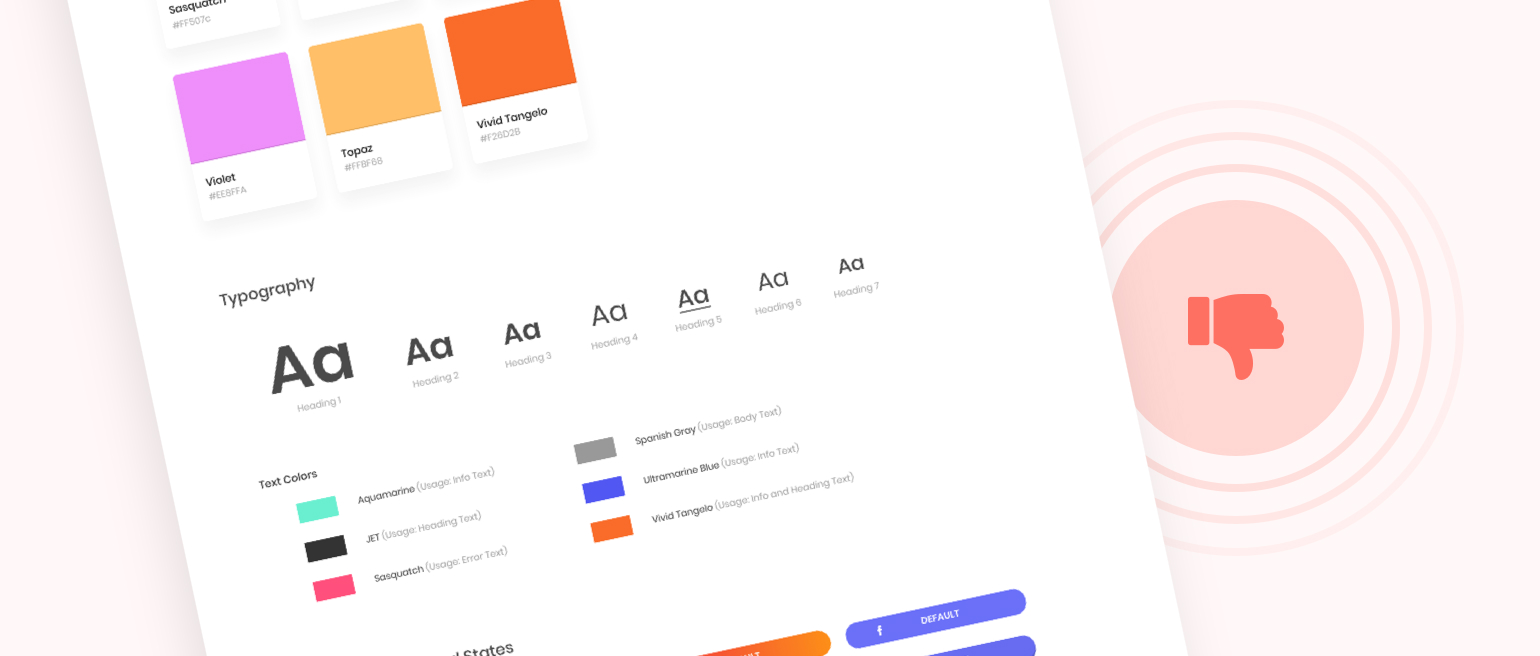
The biggest con is the limitation of the skills and artistic solutions. The UX design system is the main obstacle to finding original and creative solutions.
When the project is new. You don’t have a specific solution at the beginning of the project. It is harder to create one design system that you can use without adjustments since it’s hard to check what works the best with your target audience (hopefully you know it).
The solution is yet to be made. You still do not have any data, limitations, or a clear understanding of the target audience. It means that there is no foundation to build a system. And this might be the biggest gap and financial loss if you skip this step. Please, don’t.
In addition, small companies are in a highly competitive environment. In this case, visual standardization can hurt your business. It is better to create captivating and creative visuals to make sure the audience sees and recognizes you than to be like everyone else.
The layering and interconnection of all elements of the design system scare away and end many changes. You need a strong team that will constantly work on a design system. If it is you don’t have one, everything will quickly die out, so the design system development loses all meaning.
Why Is The Design System Important for Business?
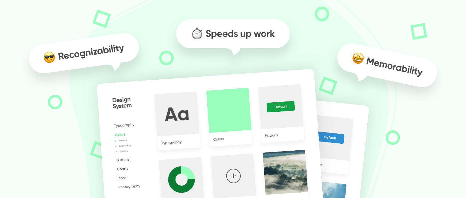
It may seem that complex design system development is needed only for large-scale companies. Their products are periodically updated, acquire new functions, or the business enter other markets. Actually, this is not true. Even a small company planning to scale is worth investing in a UX design system early on.
The design system has three functions:
-
It helps to stand out from competitors, build a brand, convey value, and evoke users’ emotions.
-
Simplifies the work of the entire communications team, speeds up the creation of visual materials, and eliminates unnecessary approvals.
-
Increases brand memorability, helps employees, clients, and investors of the company to recognize it even without a logo: colors, icons, or visual reception helps.
Even if the company does not function across the world, employees still need a presentation for a conference, an infographic for an article, or an animation for social media. Thanks to the design system, designers will cope with these tasks much faster, and your company's materials will be recognizable even without a logo or brand name.
Who Does Need The Design System?
As a company grows, many processes become more difficult to control. Including a large website with plenty of pages. And if you have this issue, please consider using the design system. You’ll spend fewer resources updating the website and you won’t need to think about basic solutions like pop-up windows and buttons over and over again.
Not only do large businesses need UI design systems, but also government institutions. They should be unified for a wide audience of users and have clear patterns. In addition, the design system should reduce the cost of production, which is also convenient for such projects.
But design, digital, and advertising agencies do not need their own design systems. It can cause some hype in the news, but no more than that. As they run smaller websites mostly showing the portfolio, which includes own design systems.
Final Thoughts
Remember that with all thoughtfulness of the design systems, it all comes down to smaller approaches that decide everything, even within the framework itself.
For system design example, the bank might have a superb design system that has been working for several years without a single question. However, the brand decided to present a new premium service for business-oriented clients. And the working design system won’t work here as you should create an entirely new design that will fit your new target audience.
A design system is just a tool, like thousands of other tools, and yes, it can help large companies or products do better. But do not forget that a design is bad if it is not aesthetically pleasing while solving users’ issues no matter how functional and technically slender it may be.
FAQ
What Should a Design System Have?
What is a design system UX? The design system should have documents, visual examples, code snippets, design guidelines, components, shapes, fonts, and other digital assets that will help to create new products for the company with its unique design.
What Is the Process of System Design?
There are four system design processes: developing stakeholder expectations, technical requirements creation, logical decompositions, and design solutions development.