The world and people change constantly and that’s why you should consider app redesign. UX and especially in UI design trends come and go every couple of years. Some of them are driven by new technologies such as touchscreen devices or new CSS properties. And businesses have different ways of dealing with these trend-driven shifts.
Gradual Improvement or Complete Redesign
It seems that companies that have reached a certain design level always approach redesigning an interface through incremental improvement. Think of apps like Airbnb, Spotify, or Google Suite products – how often do you see them change dramatically overnight?
A gradual change to the interface seems easier to manage. It costs less and is easier to do in the digital ecosystem. Thus, you don’t need to find a large budget for a large-scale project when you can only make changes where necessary with a simple redesign.
Many organizations do not go this route and feel comfortable taking on large risks, but not in terms of operational and financial terms. In a large organization that has historically focused on other aspects, perhaps development or sales, you cannot change the design overnight. However, the risks associated with a complete UX redesign will affect all aspects of the business from sales and customer support to development and PR.
Complete Redesign Risks

Imagine how a regular and active user feels when his or her favourite product changes in the blink of an eye? It is upsetting.
When scrolling through your Instagram feed or creating a new tweet, muscle memory comes into play as you repeat these steps multiple times a day over the years. Imagine that all of a sudden the order of your Instagram feed is flipped and you need to scroll up, not down. Or that instead of clicking the "Write a Tweet" button, you need to tap three times in the upper right corner of the screen. It would be unpleasant, right?
Well, many B2B apps or government agencies do just that to their users every couple of years. They receive a budget, generate ideas, and decide to completely redesign app to make it more user-friendly.
And it will be more convenient as soon as users learn it! And this crucial transition period can cost the client or user several hours to find something. So, to compensate for this, the company needs to:
- Effective changes communication (communication and advertising costs)
- Teaching material recreation (costs of rewriting articles and tutorials)
- Train customer support on new features.
While it seems like a doable task to change the documentation for one feature weekly, an avalanche of hundreds of new pages will overwhelm any organization.
In the first weeks of a major application redesign, any company needs to prepare for an increase in the number of incoming calls and tickets from customers to the support service. Even rearranging navigation elements in an application can be completely confusing for users. Not to mention removing the popular feature.
This, of course, can incur additional costs and affect the “how much to redesign an app” question for those organizations that need to hire additional support staff or expand their services if they use a third party.
In complex B2B products, dozens of features compete with each other for user attention. If you change one feature, you can easily track how users changed their behaviour within that feature and all related ones.
For example, imagine that Google Docs changes the way tables are formatted. To measure the success of a redesign, they can look at:
- New table creation speed
- The ratio of formatted and unformatted tables
- The amount of styling done by users after pasting tables from other sources.
These indicators are linked to tables. Now imagine that all of the formatting features in Google Docs change at the same time, and the list of metrics to track success suddenly grows 10x. Can you see which change has improved the user experience the most?
When putting together a product roadmap for future months, keep in mind the challenges that come with a complete redesign. Efforts to implement a new design are just the tip of the iceberg and other hidden costs will follow.
When Should You Redesign Your App?
The app's functionality, speed, and stability are very important for it to become successful.
But let's be honest, the first thing a user encounters when launching your product is what it looks like. If the user does not initially have a strong interest in the application, an unattractive design can easily make him give up on your product.
Guidelines Changes
Sometimes companies change the guidelines. And the items in the app should look different now to achieve mobile app monetization. Your product must look the same as all your business designs and ideas. This helps to raise awareness and create a strong bond between your brand and your product’s design. Ask your product managers how to redesign an app UX so they can check the issue and see if everything is alright with your guidelines.
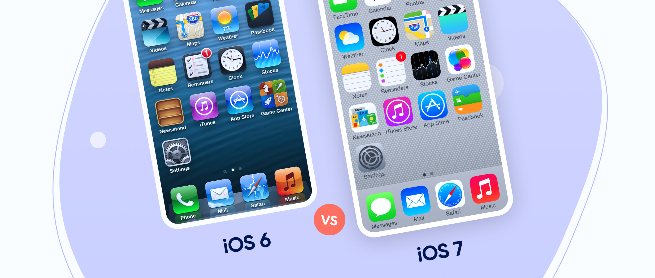
Do you remember how iOS 6 changed to iOS 7? That’s how Apple devices look for a very long time. And exactly during these guidelines reign, Apple has become the most popular tech company.
Old Design
If the current design doesn’t match the current trends and looks way too outdated, maybe it’s high time to change it. Each mobile apps business model should have a strategy that covers the redesign when needed. It’s not that scary as it may seem, whilst it is very important to be modern and useful.
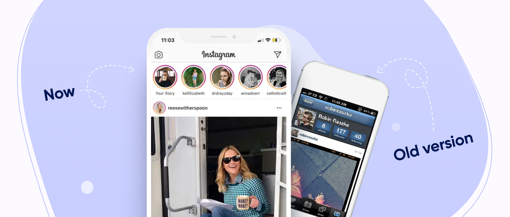
Do we need to say more about how weird Instagram’s design used to be? However, it turned into a nice one that we have today. Even though Instagram is terribly popular, people still need to be engaged and followed across the app with the help of the UX designer.

Launching on Another Platform
Let's say you have developed your application for iOS, and now you are thinking about launching it on Android. The cheapest option is to leave the design just like that.
But some product owners want to change the design depending on the particular platform’s aspects. It is possible if you have a budget for it. Each OS has its own guidelines and it will be much better if you’ll use them rather than just simply launching the app from another OS.
The recent most popular app Clubhouse went online on Android platform thus resulting in new users that brought money to the owners. Even though you can’t spot much design difference, it is there to follow the Android guidelines.

Complicated Design
Your application does a lot of things, and it does them well. The only problem is that a confusing interface can confuse an unprepared user.
Many different menus, sidebars, switches, etc. The design should be as simple as possible. The average user is pretty spoiled by design delights, so often even luxurious functionality will not be able to lure the client if the application looks too complicated.
The way out is to simplify the existing interface. Or do something much more radical, like splitting the massive application into several smaller applications so that each is responsible for one large function.
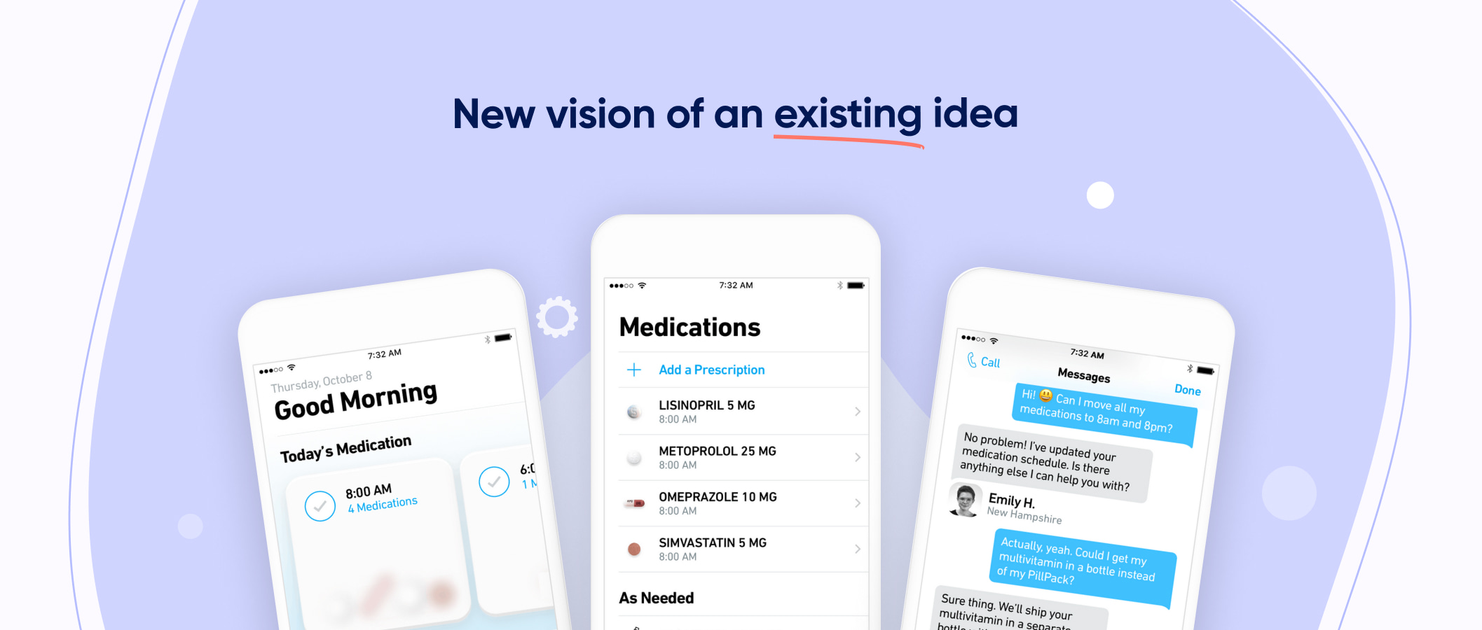
As an example, there's a PillPack app that Amazon bought in 2018 for billion dollars that helps people to order medications. But there was an issue – people kept forgetting their meds. So the developers have sorted the prescriptions in the app which resulted in many new users.

Rebranding
Have you changed your logo or corporate colours? Have you changed the content of your brand book? Amazing! Now the main thing is not to forget about making change app.
If your old logo flaunts inside your application, or the color palette differs radically from your company's corporate color, this may confuse the user: is this the correct application? Isn’t the app supported by the developer at all? To avoid such situations, when rebranding, you should not forget about your mobile application.
Even when it seems ridiculous or totally unnecessary, go and study your target audience, they’ll probably need it. Check the Contap redesign, it is quite new and modern. The developers reorganized the navigation and changed the colour palette. It helped the clients to create a better app for their users and be more recognizable due to the new logo and colours.
Great Functionality, Bad Design
Today, even for the most specific tasks, there are many alternative solutions from different development companies.
And if in earlier years the application could be forgiven for mediocre interface design and non-compliance with the basic principles of UI/UX design, since it could have no alternative at all, today, all other things being equal (both applications regularly perform a similar set of functions), it is not difficult to guess which application the average user would prefer.
Sometimes, design thinking can save a company from bankruptcy and failing as it happened to Airbnb. In 2009 the business experienced financial issues that almost got them shut. However, after a thoughtful analysis of the app, the owners noticed that the biggest issue for their users is apartment photos of bad quality. So they packed their bags, went to New York, and took high-quality photos of the Airbnb users flats that brought the team back on track.
Conclusion
Redesigning the mobile app to suit your user needs is the only reason driving the industry that serves your user with more advanced features leads to the development of ideas.
And, of course, developing a quality app helps you know how to approach an app redesign that encourages developers to redo mobile apps. The audience plays a vital role and has always been the focus of any brand. Carefully analyze the audience that uses your app and find reasons to redesign your mobile app, then work for it.
With this kind of support, guidance, and motivation, redesigning an app can be the best way to retain users. With this attitude, you define changes for your application. The change in appearance and appearance inspires users to connect more meaningfully with each other.
Retaining users means earning more money and affects your profitability. In this ever-changing world, app design must be modern and contemporary. A new look may be attractive today but tomorrow it may stop being interesting. And keeping users interested and feeling user-friendliness should be a priority for this UI design.
If your focus is on the younger generation, then the UI design of the mobile app should be smoother. Mobile app users usually choose an app that can navigate quickly and easily without too many bugs and issues.
Finding a solution to increase the use of redesigned features increases productivity, which ultimately increases the popularity of applications. When redesigning a mobile app, several factors are taken into account, and working on them provides excellent results. In addition, it is important to remember the difficulties that are being faced. Many of which have a complex procedure, but learning them improves the usability of the application.
To stay on the market, try to regularly review the key data related to the application. This can help you create a clear vision of how you can get started on your app redesign.