
People often use mobile devices, so business owners need to pay attention to statistics. As a matter of practice, mobile phone and tablets users spend less time on the Internet and choose the first sites offered by Google. While PC users can spend more time searching for information. Therefore, your website must be well optimized for search engines and follow all the Mobile-First requirements. Therefore, one of the most important requirements Mobile First development is:
-
The most important thing comes first;
-
The website should be optimized as the connection speed of the mobile network may be slow depending on the location of the user;
-
The website should not load more than the user needs to get the information they need. Additional information should only be displayed when requested by the user.
So the Mobile First approach helps to design an optimized website for different mobile devices based on the network connection speed. Note that important content should come first.
How to Make a Mobile-First Website

The design should always match the screen. And after designers create the perfect website, the programmers start mobile website development. In some cases, different variants of the code are used.
New website code is generated for the desktop version after writing mobile-first content. If you need to add any enhancements, you must first create them for the mobile version and then adapt them to a desktop version.
75% of mobile phone users hope to get the information right after the click. They won’t wait for the page to load. If it takes a lot of time to show the information, the user will visit another website.
77% of smartphone shoppers will buy an item from a store that loads quicker, than others. Mobile conversion rates increased 64% over desktop average conversions. This helps to understand that indeed, mobile-first development is one of the things to consider before creating a product.
What Should Be On a Mobile First Website
-
Information is displayed correctly in both portrait and landscape views;
-
All clickable elements work;
-
There are no images that slow down page loading;
-
There is nothing Flash-related on the site;
-
No pop-ups that cover half a page;
-
No horizontal scrolling;
-
The contact number is clickable or at least the user can copy it;
-
The registration form fields are short and simple, the autocomplete function is disabled (incorrect information can be fetched);
-
All buttons are made with CSS, no image buttons;
-
The size of pictures changes automatically depending on the type of device;
-
It is possible to purchase with one click.
This all possible with latest technology stack that we use at Owlab:
-
Python;
-
ReactJS;
-
Kubernetes;
-
Django;
-
NestJS;
-
PostgreSQL;
-
WebSockets: iOS (Swift);
-
Android (Java, Kotlin).
You can always check our Web Portfolio & Mobile Portfolio and see which approaches helped us to bring the best results to our clients.
Pros of the Mobile First Approach

Let us remind you that today the number of users using mobile devices for surfing the Internet has reached 60%. And therefore, using mobile-first web development provides great benefits for these users in the first place:
-
One website for all devices;
-
Users will get the important content of the page first;
-
Fast page loading at low connection speed;
-
Convenient interface navigation on the mobile screen;
-
The minimum amount of web resources required to display the main content;
-
Top positions in Google search results.
When users started surfing the Internet via their smartphones, websites were slow. Most of the time, they did not even work on small screens. To solve this problem, companies started building mobile versions of their sites. When users try to access the site from their phone, they are automatically redirected to the site with the "m" prefix in the address bar.
Why Mobile First
The mobile-first format is convenient for projects offering services and goods. It is important that the user finds all necessary information in a second and has some time to make a quick decision.
For example:
-
Food delivery;
-
Taxi;
-
Internet stores;
-
Remote services (internet banking);
- Social networks.
If all the necessary information can be put in several sentences, then surely start with mobile versions for your business.
Check our mobile iOS app development services as well as mobile android app development if you want to create a superb product that will bring you profits.
Elements and Differences

There are plenty of different elements in the mobile and desktop versions but each element creates a user-friendly design.
Buttons
The desktop is equipped with a super-precise mouse which helps the user to enter data. But when the user uses a smartphone, the finger is the only available thing to enter the same data. Therefore, developers create small buttons for the desktop version and large ones for the mobile version.
Keyboard
You use a nice, large keyboard when using a computer. But when you use a smartphone, you get a small keyboard that occupies half of the screen. Therefore, you can offer the user to type something on the keyboard in a desktop version, but it is better to avoid such an offer when the user uses the mobile version. The same applies to hotkeys since it is difficult to use them on the phone.
Screen
A smartphone application is a single column with text and pictures that can be scrolled for a long time. The desktop has a wider screen where you can place text in two columns, add pictures and banners.
Content
Developers place content vertically – from top to bottom, in mobile website development. And when creating a desktop version, developers place all the content horizontally – from left to right.
The mobile version of your website should contain the same information as your desktop site. Google warns that if you specifically host less content on a mobile page than a desktop page, you should be prepared for a drop in traffic when indexing that page.
The specific advice that Google gives in this case is to make sure that the titles on the mobile version match the titles on the desktop.
Possibilities
It is easier to dial a number in the application when the user uses a phone. It works perfectly with apps like taxis when there is an urge to call the driver. And it is easier to type a message when the user works on the computer.
Recognition
A smartphone is such a personal item. The user opens it with the help of the fingerprint, the phone has all personal information, including the option to pay with it with the credit card in a second, and many more. That’s why the smartphone is always the most preferable option for a product. It’s just easier for the user to pay for services or products without thinking twice.
Stages of Creating a Mobile Application
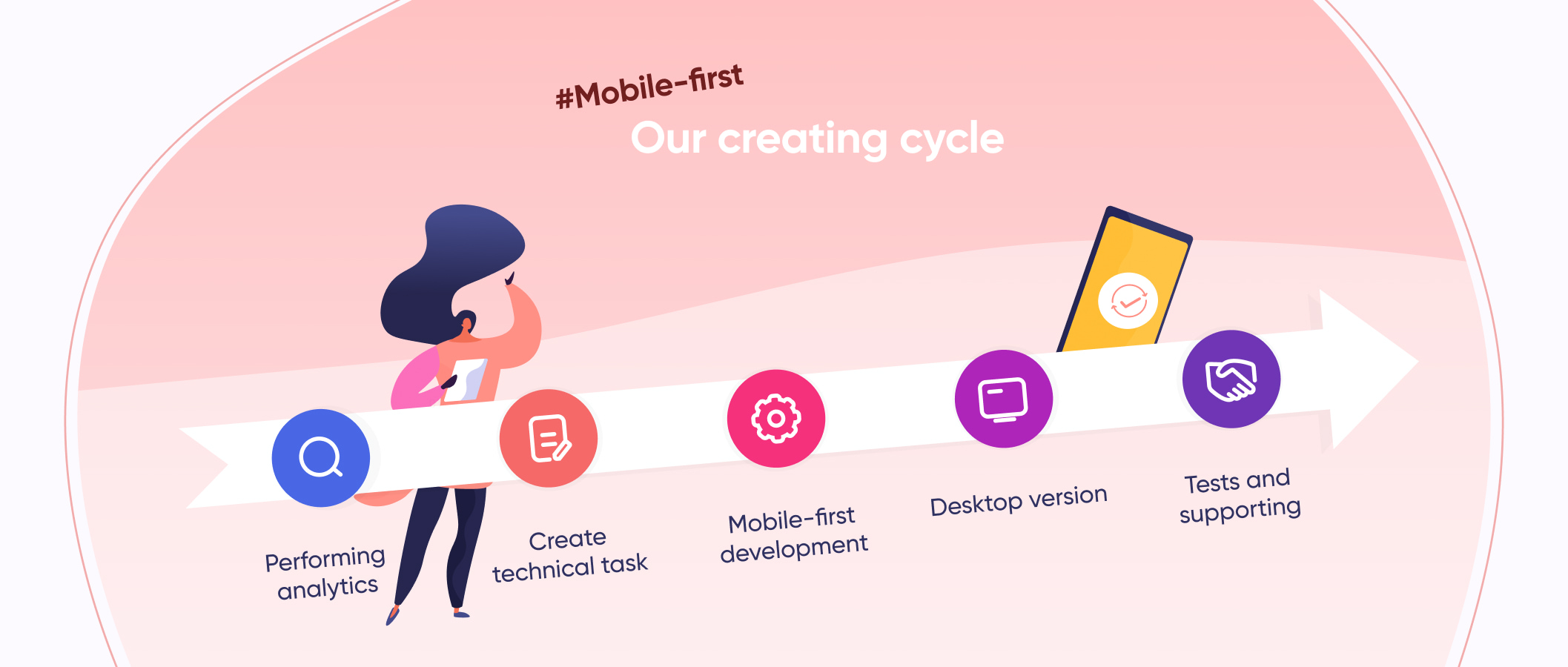
Many studios plan the work in many different ways. As for us, we work in such manner:
-
We start with analyzing the task and performing analytics;
-
Then we create a technical task;
-
Our engineers and designers receive the technical task;
-
Engineers and designers work on mobile-first development;
-
Then we create a desktop version;
-
After, we perform tests;
-
And after the work is done, we keep supporting the project.
We hope you won’t skip the first stage since it is highly important. During analytics, we understand the market and see what are our strengths and weaknesses.
Thanks to a competently drafted technical specification, our team of designers and developers clearly understands what kind of service the customer wants to receive, and gradually implements the initial idea.
Final Thoughts
It will take time and effort to develop custom mobile pages at first, but it will be easier for users to achieve certain goals, despite many limiting factors. Mobile development is something that each business should take notes on now.
To sum up the pros:
-
most users immediately get the best functionality on the site or in the application;
-
more payments come through the mobile-first products since it is easier to pay from the phone;
-
websites load faster since they are already optimized;
-
search engines rank mobile-first applications better.
The disadvantages arise from the fact that you have to make not one, but two products: for mobile and everything else. And you also need to take into account that different screens have different resolutions. Besides:
-
such products take longer to develop;
-
development and design are more expensive;
-
you have to maintain a design for older devices with small screens or non-standard specifications.
We highly recommend thinking about why and what is mobile-first development for you. You can always ask us if you feel that you need more answers. We will do our best to provide you with important information and suggest the best for your business.